Alternating Style Queries
With the container style queries on the horizon, it is a good time to do more experiments with them. In one of my recent experiments, I found out that style queries will allow us to do what the currently specified (but not implemented by anyone) function toggle() was supposed to.
Disclaimersanchor
-
This article is about an experimental technology. While container style queries are present in stable Chrome, they are not available in FirefoxGo to a sidenote, and are not there in stable Safari — only in the recent Technology Previews.
Do not rely on this in production. I will provide screenshots for all the examples in this article when viewing it in browsers without style queries support, but I recommend checking them out in Chromium-based browsers, or the latest Safari Technology Preview.
-
I won’t go into describing what style queries are: multiple people have done this before, and this article will expect the reader to be familiar with the basics of how they work.
Here is a list of articles I recommend to check out if you’re not yet confident enough with the style queries:
The Techniqueanchor
What happens if we apply a style query for a certain CSS variable, but then change this variable based on that query?
Due to how style queries work — they apply not to the container itself, but to its descendants — this does not create any circularity issues. But what if we nest the same element multiple times?
Let’s look at a simple example:
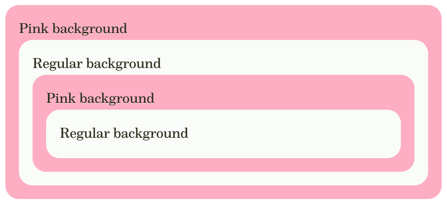
In HTML, we’re using the same class for all elements:
<div class="test">
  Pink background
  <div class="test">
    Regular background
    <div class="test">
      Pink background
      <div class="test">
        Regular background
      </div>
    </div>
  </div>
</div>
And here is the CSS responsible for the backgrounds:
.example-1 .test {
  background: var(--bg);
  --bg: var(--PINK);

  @container style(--bg: var(--PINK)) {
    --bg: var(--THEME_BG);
  }
}
And that’s it! That’s the techniqueGo to a sidenote!
We can see how every time we nest an element into itself, its styles change, alternating between two modes: pink and regular.
By default, a pink background is applied. This makes it possible for any children to hook onto this via style queries, but then when we change the variable through them, the new value will be used for the further descendants, making the style query no longer apply to them, and allowing our original value to be used. Then, everything repeats.
The effect itself is not groundbreaking: if we have control over HTML, we can output alternating classes that result in the same visuals. However, even if we can control HTML, the logic required for this might be prohibitively expensive, especially for cases involving user-generated content, and for any component-based architectures, where we’d want every component to be independent. Having a more flexible CSS solution for this problem is welcome, and can unlock new possibilities.
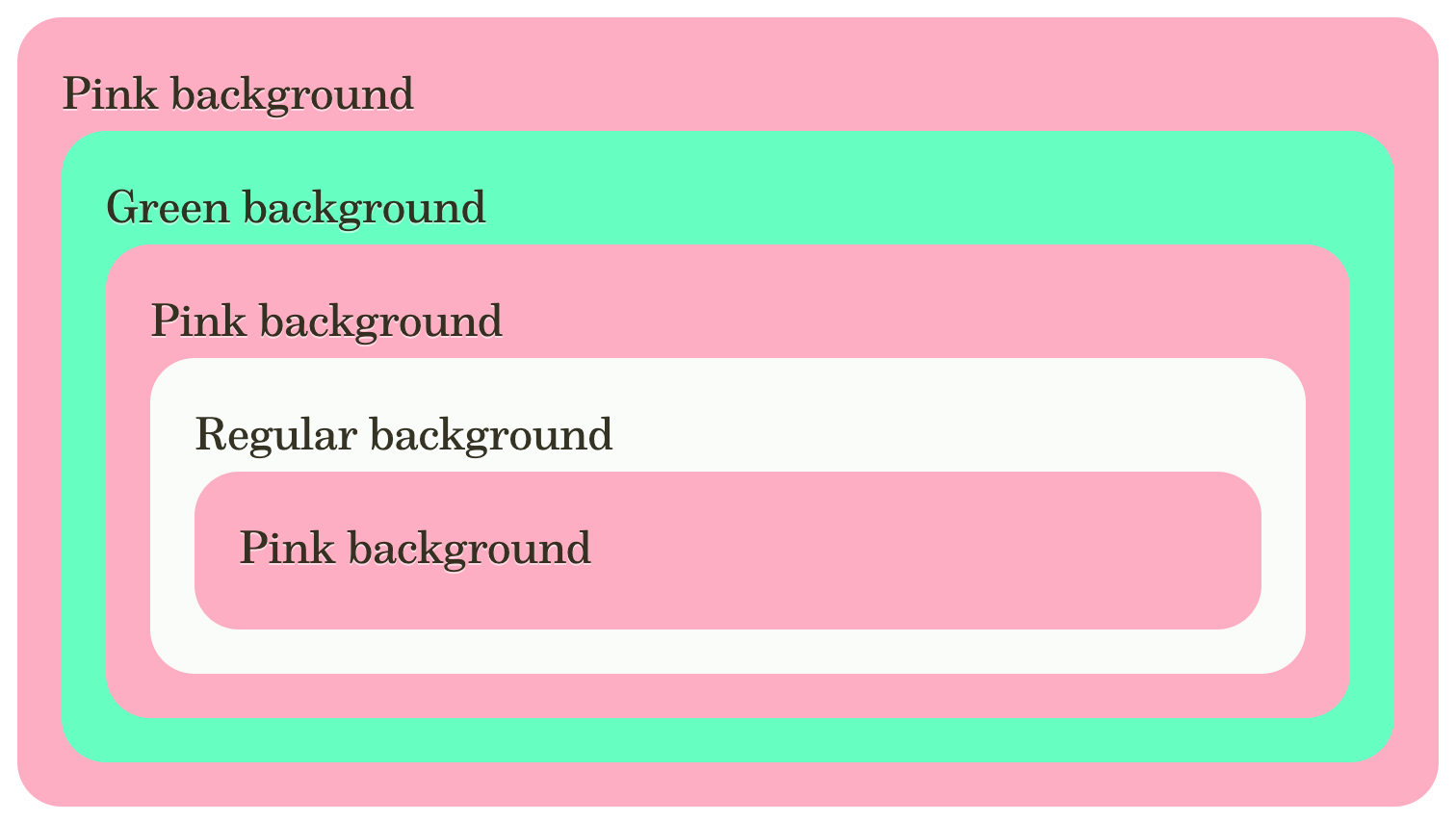
Three or More Valuesanchor
We are not limited to two possible values: we can do the same with three or more, alternating between them in a cycle:
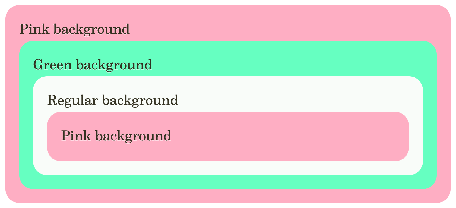
The HTML structure is the same, all we did was add an extra style query in CSS:
.example-2 .test {
  background: var(--bg);
  --bg: var(--PINK);

  @container style(--bg: var(--PINK)) {
    --bg: var(--GREEN);
  }

  @container style(--bg: var(--GREEN)) {
    --bg: var(--THEME_BG);
  }
}
Cyclic Toggles Abstractionanchor
In the examples above, we are relying on the value itself, which might not always be future-proof and extensible. While we can use CSS variables for the values both in style query conditions and in properties, relying on specific tokens, even when abstracted, could be not ideal.
Thankfully, this method works wellGo to a sidenote with cyclic toggles, which allows us to define all the values differently. Not always this will be better: cyclic toggles, after all, require a lot more setup, but it is good to have a choice and be able to use alternating style queries to switch between cyclic toggles' values.

HTML for this example is the same as for the previous one, but the CSS is different:
.example-3 .test {
  background: /* 1 */
    var(--mode--regular, var(--THEME_BG))
    var(--mode--pink,    var(--PINK))
    var(--mode--green,   var(--GREEN));

  --mode: var(--mode--pink); /* 2 */
  --mode--regular: var(--mode,);
  --mode--pink:    var(--mode,);
  --mode--green:   var(--mode,);

  @container not style(--mode--pink: ) { /* 3 */
    --mode: var(--mode--green);
  }

  @container not style(--mode--green: ) {
    --mode: var(--mode--regular);
  }

  @container not style(--mode--regular: ) {
    --mode: var(--mode--pink); /* 4 */
  }
}
A few things to note here:
-
I prefer to put the actual values first in the rule: in this case the declaration of the
background, as the rest is the setup for the cyclic toggles. -
We need to repeat the default state: this is required for graceful degradation. Later we will define all states inside container queries, and we need to choose one value that we will apply by default when they are not supported.
-
While, ideally, I’d like to use
@container style(--mode--pink: initial), there is a Safari TP bug that prevents us from using theinitialvalue in container queries. To work around this, I’m inverting the logic to check for “the absence of the space value”. -
Because we rely not on a specific value, but on the difference between a “space” and
initial, the first time the selector matches, its parent will not know anything about the cyclic toggles, making all three container queries match. This means that we need to put the value we want to have by default last (or control this with other means, like with@layer), allowing it will be chosen in this case.
Cyclic toggles result in a more complicated setup compared to when we relied on the values themselves but makes it easier to work with them in the future.
This is Like toggle(), maybe Betteranchor
Interestingly, when I was thinking about the use cases for this technique, I remembered that there is something in the current specs that is strikingly similar!
It is the toggle() function that is currently specified in the CSS Values and Units Module Level 5.
The
toggle()expression allows descendant elements to cycle over a list of values instead of inheriting the same value.The following example makes
<em>elements italic in general, but makes them normal if they’re inside something that’s italic:em { font-style: toggle(italic; normal); }
Thinking about it, switching values based on what is inherited from the element sounds close to container style queries.
A Bit of Historyanchor
This idea of an ability to cycle through different values of a property based on its previously used value comes as far back as 1999. In the www-style mailing list, David Baron proposed a universal cycle() function for this purpose.
In 2011, wasGo to a sidenote added it to CSS specs based on a resolution from 2009 which, in turn, did link to other resolutions.
LaterGo to a sidenote it was renamed to toggle() and exists in this form in today’s “CSS Values and Units Module Level 5”.
I don’t know if any browser attempted to implement this, even though it was in the specifications for that long.
Differences from Alternating Queriesanchor
If we read about what was specified, we could spot a few differences from what container style queries allow us to do:
-
Because
toggle()is intended to work with the computed value, it is akin to the style queries if they could work with the regular properties. They do not require the selector that sets thefont-styleto match — they look at the inherited value. This is the main area where it might be more powerful than our “alternating style queries” technique. -
However, there are several limitations in the specs: no
attr(), nocalc(), andtoggle()can be strictly the “whole” value. Our version with the cyclic toggles is more flexible in all these cases. -
toggle()can “short circuit” when it matches the first value it encounters, making it not possible to do a more elaborated cycle likea → b → a → c. With cyclic toggles, we can create multiple instances of a single value, and thus make more varied chains of alternations.
Let me show you an example of the last point:
With toggle() this is impossible.
Use Casesanchor
In the simple examples above, we did see how we can alternate between different backgrounds or themes on nested elements. Let me demonstrate more examples, starting from implementing the use cases from the toggle() specs.
Repeated Emphasisanchor
This is an obvious use case: when we are trying to emphasize something that is inside an element that was previously emphasized with the italic font-style, the common design practice is to revert it to normal. While we can’t replicate the way it is described in the specs and base our style on the computed value of the font-style, if we know which elements can define it, we can handle them all in one rule.
This is some blockquote that contains an emphasized part inside of it.
There is also an
inlinecode element, and even an emphasizedinlinecode element.
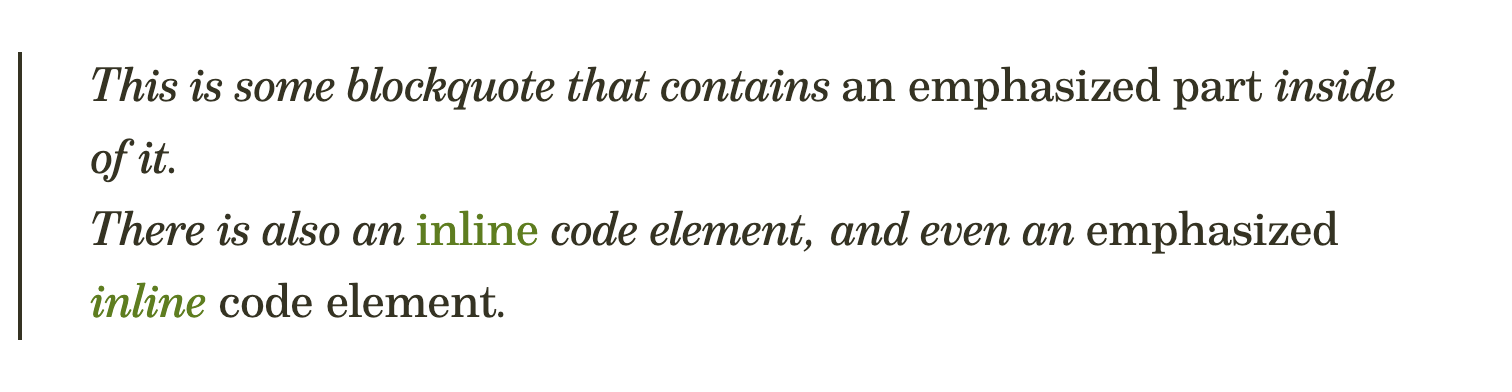
The CSS for this exampleGo to a sidenote is almost the same as in the first one in this article:
.example-4[class] :is(i, em, blockquote, code) {
  font-style: var(--font-style);
  --font-style: italic;

  @container style(--font-style: italic) {
    --font-style: normal;
  }
}
Because we switch between italic and regular font styles, we don’t have to incorporate cyclic toggles. Although, we could come up with a better design for nested emphasis. But I’m not a designer.
Custom Marker Stylesanchor
Another example from the toggle() specs, this time with more than 2 variations, similarly, an application of our second example from this article.
- Regular item.
- Nested list:
- Regular item.
- Nested list:
- Regular item.
- Nested list:
- Regular item.
- Nested list:
- Regular item.
You can see three different list item styles in this example:
- “built-in” is the browser’s default style. All major browsers are consistent: they start from a
disk, then change to acircle, then to asquare— and that’s it, any deeper-nested lists will have the square. - “custom” is the same three symbols, but applied with our alternate queries, allowing us to restart the cycle with the
diskafter the third level of nesting. Curiously, the example in thetoggle()specs mentions theboxwhich is not a validlist-style-type. - “very custom” uses custom strings as markers, alternating between stars with different numbers of rays.
I did implement the “very custom” variant differently than the other example:
--m1: '✦ ';
--m2: '★ ';
--m3: '✶ ';
--m4: '✷ ';
--type: var(--m1);

@container style(--type: var(--m1)) {
  --type: var(--m2);
}
@container style(--type: var(--m2)) {
  --type: var(--m3);
}
@container style(--type: var(--m3)) {
  --type: var(--m4);
}
@container style(--type: var(--m4)) {
  --type: var(--m1);
}
This example demonstrates how we can “save” specific values into separate CSS variables, and then mention them both in the style query’s condition and the variable definition. By “abstracting” the values this way, if we change them, we won’t have to adjust the conditions and --type definitions.
Alternate Layout Directionanchor
I remember wanting to alternate column and row directions in layouts in the past, but I can’t remember the exact cases. When doing research for this article, I did see people asking how to do a similar thing, for example in this post.

In this example, we alternate between column and row flex-direction, at the same time adjusting the background of the elements. You can see how pink elements have columns, and regular elements have rows. This is done automatically, without us doing anything in our HTML outside of nesting the elements.
One More Caseanchor
The last use case I wanted to show you is even more unusual and ended up being complex and important enough for me to split it into a separate article.
Update from 2024-04-19: and here it is, published: “Self-Modifying Variables: the inherit() Workaround”.
Do We Need the toggle()?anchor
If we could achieve what toggle() was supposed to do with the alternating style queries — would it be needed at all? Given no browser did implement it, could we retire it from the specs?
I think it depends. First, it is not certain that we will ever (or soon) get proper container style queries for regular properties — this is one aspect where toggle() could be useful. Then, there is a question of style queries' verbosity: after all, they require more setup, and it is easy to make a mistake when writing them, more so with cyclic toggles. A built-in specialized feature could be much more reliable and simple to use: think of light-dark() and how it allows us to implement what we can otherwise do with custom properties and space toggles.
However, if toggle() will ever be implemented, I think its specs will need extra work and more thought put into it. Many things changed in CSS: how we approach it, and limitations disappearing, resulting in the potential for this function to be revisited.
-
I would change its name to something different. It might be easy to confuse
toggle()with another abandoned proposal, and if it were up to me, I would choose a name likealternate(). -
I am not sure the
attr()andcalc()limitations are necessary. I am not sure about the original reason for them, but if they could be lifted — it would be much better. -
I wonder if it could be possible to make the “short circuit” go away and to allow repeating values for more interesting patterns.
All that said, the bigger question is: how many use cases are there for this? If container style queries cover all but a few, how important it will be to implement this built-in function? After all, it was in the specs for years and years, and no browser did implement it, and we authors did not actively request it.
Removing it from the specs could be an option — this way it will be easier to focus on something else. There are many other crucial things in the CSS specs that are not implemented by anyone. What do you think?
For now, I hope the support for container style queries will become better. They are tremendously powerful, and I feel that there are many other things they can allow us to do. If you have not yet — I recommend you to go and play with them yourself.
Published on with tags: #Style Queries #Future CSS #Experiment #CSS