Battle for Baseline
The best solution for inline blocks were, well, inline-blocks. I used to like them because you could solve a lot of tasks with them. But they’re not ideal. They’re not capable of doing baseline vertical aligning right. And the problems come straight from the specs, just read the last two paragraphs to see the problems:
-
“The baseline of an
inline-blockis the baseline of its last line box in the normal flow.” -
“If [
inline-block’s]overflowproperty has a computed value other thanvisible, [its] baseline is the bottom margin edge.”
Those rules make only one lined, simple inline-blocks usable with vertical-align: baseline, in all other complex cases, we would get not what we would need.
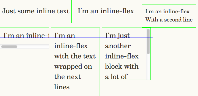
Here is an example: all three blocks have display: inline-block, the first one is simple oneliner, but with bigger padding, second one is multiline, but has smaller font-size and the third one has overflow: auto.
With a second line
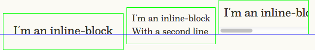
You can seeGo to a sidenote where each block has its baseline in this example.
inline-tableanchor
Actually, there was one place in CSS, where the baseline aligning worked properly: display: inline-table. If we’d use it instead of inline-blocks in our example, we’d get almost what we tried to achieve:
With a second line
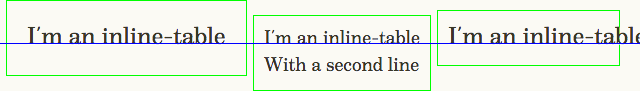
You can see an obvious flaw: the overflow: auto is not working. And you shouldn’t forget that you’ll need to have table-layout: fixed. So, inline-table is nice as long as we don’t need overflow other than visible.
Trying to go flexanchor
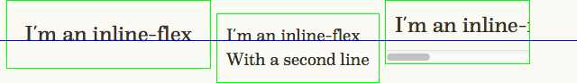
So, can we do a block both with the proper baseline and with some overflow? It seems we can, using flexboxes — display: inline-flex. In theory, they have a correct baseline position in all complex cases, but what would we get in practice?
With a second line
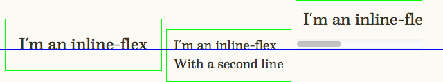
If you’d look at this example in any browser other than Firefox, you’ll see nicely aligned blocks (yep, even in IE10 and Opera 12).
But in Fx the block with overflow: auto, suddenly, behaves just like the inline-blocks — it loses the baseline. So sad, this way we’ll need to wait for this newly reported bug to be fixed.
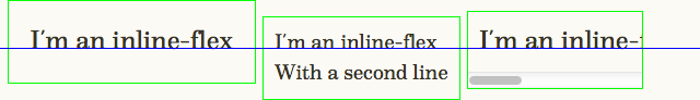
Is there another way?anchor
It is nice we could align inline-flex blocks with the baselines of other blocks, if only there wasn’t this Fx bug… But what if we’d go and try to align not different inline-flex blocks, but their children?
With a second line
Oh, it works. But… While multiple inline-flex blocks could wrap on overflow, for elements inside flexbox we would need to use flex-wrap to wrap them. And guess what? Firefox didn’t support this property until 28.0.
All togetheranchor
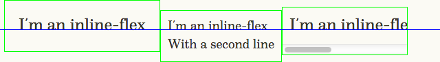
But hey! If inline-flex is properly aligned alongside other blocks and the nested block with overflow: auto also has a proper baseline, then what if we’d combine those two? We would add another wrapper inside each element, then move all the paddings and overflow to them:
With a second line
In most browsers you won’t see any changes, but when we’ll look at Fx, we would see that the blocks now won’t have baseline at their bottom margin edge. But they won’t have it at the proper place either — they’re shifted from the baseline of other blocks a little. Let’s measure it — 10 pixels. Hey, it is our padding! By removing paddings from each side we found that the problem is at the top padding — when we remove it everything works great. So, if the bug is in the padding (and I reported it too), how could we work around it? Let’s remove it and replace with a pseudo-element:
With a second line
Perfect!
Finishing strokesanchor
Well, not perfect. There are two small issues that can appear in IE 10 and Opera 12.
In IE flexbox with the set width wouldn’t have wrapped text inside of it. That’s a rather strange bug, but we could work around it by adding width: 100% or -ms-flex-negative: 1 to the inner element, the latter is better.
Opera has a similar bug — the element inside a flexbox would have the width set to content. The only fix I found is adding flex-direction: column to flexbox. As there would be only one element inside our wrapper, it won’t affect anything else.
There, now it’s perfectGo to a sidenote, there is the last example with different variants of blocks and with the wrapping blocks:
With a second line
The resulting code for this example would be:
.flex {
    display: -ms-inline-flexbox;
    display: -webkit-inline-flex;
    display: inline-flex;

    /* Fixing Opera issue */
    flex-direction: column;

    vertical-align: baseline;
    }

.flex-content {
    padding: 0 10px 10px;
    border: 1px solid lime;

    /* Fixing IE issue */
    -ms-flex-negative: 1;
    }

/* Fixing Fx issue */
.flex-content:before {
    content: "";
    display: block;
    padding-top: 10px;
    }
Overallanchor
Ah, Firefox! Without its bugs (and IE’s one) we could use only one element per block. Also, if you’ll need just multiline inline blocks, and you’re not afraid of tables, you could use display: inline-table.
But, overall, we won. We can now use baseline vertical aligning for blocks of any complexity, hooray! But if you’d want to write even better code in the future, I’d recommend you to go and vote for the corresponding bugs in Bugzilla.
Let me know what you think about this article on Mastodon!
Published on with tags: #Practical #CSS Flex #Bugs #CSS