Correct Cursor on Active Elements
Every active element must have a set cursor on hover. And it should be cursor:pointer in most cases.
By active elements I mean links, buttons, selects, labels with checkboxes and radio buttons, and other similar elements.
Those elements should be treated as “active” when clicking on such element results in any action. Thereby a menu item for the current page, checked radio button or disabled buttons or links are not active elements, so they shouldn’t have any change on hover.
At first I thought it’s obvious, but then I found out there are a lot of developers who think otherwise. And I didn’t find any proper arguments against cursor:pointer for active elements after reading all their points of view.
In this article I’ll tell you my arguments at first, and then I’ll discuss all the arguments against my point of view, describing why those arguments hadn’t incline me from it.
Benefits of using cursor:pointeranchor
Visual Feedbackanchor
For me the main profit from changed cursor is the visual feedback. Ideally every custom element should change its state on hover. However, in real life such state could be absent or wouldn’t differ much from the original state, or would happen with a transition. So there would be no feedback, or it would be not obvious.
But you surely would see when the cursor changes — this happens instantly and stable. The click that could follow the mouseover would be intuitive, otherwise the brain would need to match the position of the cursor with the element or spot the element’s change and then find out if it’s a hover state over this element’s active area or something else.
Changing of the cursor is the most natural, noticeable and obvious feedback you could easily add to any element. Of course, it’s not the best variant, but it’s cheap and easy. If you could add a distinct visual state on hover, then it would be even better.
Delimitation of the active areaanchor
There are a lot of cases when you should hint to the users that they could click already. You could often want to increase the clickable area of different elements, like for small icons or for menu items placed near the window edges. In those cases adding a cursor on hover would help users to find out when they could click on an element.
In some cases, when there are adjacent elements, the cursor wouldn’t be enough to tell which element is hovered — in those cases you should change the visual state of those elements.
Anyway, if you’d hint users when to use any specific active element, users would know it and it would be easier for them to use the UI next time — they’d need to aim with less precision, because they’d know that active area of an element could be bigger than it can be seen. And when they’d move the cursor they could click right at the moment the cursor would change. Otherwise, if an element don’t change its cursor on hover, the users would need to aim carefully to hit the area of a small element like icon or checkbox.
And I could argue if someone would say the active area of an element should be as big as its visual representation, but I’ll keep my arguments on this topic for another article.
Arguments against changing the cursoranchor
I really did try, but hadn’t find any proper arguments against changing the cursor over the active elements. Most of those arguments can be described as “Don’t break users’ habits!”
But you can’t treat the presence of habits as an argument. This means there was one of the possible solutions and it was either the only one there, either it was the best at the moment. The habit should be treated in its context, and in context of what would happen if we’d brake it. Would it be destructive in some way, or it would be just a matter of minor users’ discomfort?
Another fact is that not all of the habits are good. If we’d always stay with the users’ desires, the progress would stop. Often users become used to the things that only hinder them. A clear example of such bad habit are labels for checkboxes and radio buttons. Lazy developers didn’t bind them together for years, so users often don’t know what the labels could be actually clicked, so they spend their time and efforts trying to hit those little areas of those little controls even if the labels are clickable too. It’s a great example why you should not only bind the inputs with labels, but also tell users about it with all possible ways.
We could divide the “habits arguments” into different categories. I’d try to answer the most frequently used arguments against the changing of the cursor on hover.
“The cursor doesn’t change in users’ OS”anchor
In OS the most used cursor is just an arrow. It doesn’t change over most of the system controls like buttons. However, the question is “Is this really good?” Is it familiar? Yes. But is it usable and could it be better? I often see how some desktop app is not usable because I need to guess where to click — there are no signs of active areas.
When we are talking about desktop we should also talk about games too. Unlike apps, games often have custom cursors that are changed over different UI elements. In comparison with modern games most of the web apps feel like the old games with pixel-hunting — you have to guess where to click and where to hover in order to do something. However, recently the web apps tend to use more cursors for different actions like drag-n-drop or resize. But why then use the default cursor for buttons? cursor:pointer would fit great there. And when we’d look at the checkboxes and radio buttons, then there should be not only a distinct visual hover state like changed background, but you shouldn’t forget to set the cursor:default for them — that’s the cursor the desktop apps mostly use to select something. But if selecting the checkbox or radio button results in a UI change like expanding the accordion’s section, then the best cursor would be a pointer one — telling something would happen after you’d click.
Web apps are not the same as desktop apps, there are a lot of new patterns and UI elements there, so it’s time to think again and decide which habits to forget.
“I see a pointer cursor and think it’s a link!”anchor
Ah, that’s another often used argument. When there were no web apps, there were only linked textual documents. The apps mostly didn’t have such links, so in browsers, to tell users what the HTML <a> is, there appeared underline, blue color and a pointer cursor. And as all the buttons and inputs were system controls, they inherited the default behavior with the default cursor.
Years passed and sites become more complex and UI-rich, designers created new controls and they often were just the links disguised as buttons and other elements. And in most cases nobody removed the links’ cursors. So if you’d look at the modern sites, most custom buttons would be actually links and would have cursor:pointer there.
In fact, you should forget the “pointer is for links” thing a long ago.
“But you could open links in new windows, get the contextual menus for them…”anchor
Well, yeah — links are not buttons, and buttons are not links. But that doesn’t mean the behavior of hover for links and buttons should differ.
Nobody would expect an ability to open something in a new tab from the button. In each case both the links and the buttons would have their context where users could either await the link’s behavior, either they would just use the control they have. And it really doesn’t matter which cursor the users would see — if users would see a cursor in a links’ context, they would treat it as a link. But if users won’t expect a link, the button underneath would be ok. If users would like to attach a file, they won’t need the link’s behavior. If users would like to send a form, they would just do it, even if there’d be a cursor:pointer on it, the users won’t go away and won’t try to open it in a new window — they already know how to use search forms. The only place when the users would be confused — if you’d do it reverse: make a button look like a link — be blue and underlined.
Further more — there are already a lot of links that don’t look like ones and other elements that are disguised as links. Different dropdown handles, filters, cuts, closing icons, “cancel” links — a lot of sites have a lot of elements using different tags in HTML for them and having this cursor:pointer. Why would then simple buttons or selects have default cursor instead of the one all other controls have?
There is a great example from one company’s service:
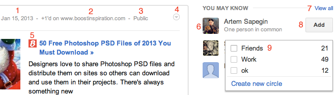
You could try to guess which marked elements are links, which are not; which have cursor:pointer, which don’t. What would happen when you’ll hover or click any of those elements? You can think for a while, and I’ll give you an answer later.
If you’d say straightforwardly “only everything that have href must have a cursor” then a lot of confusing things could appear. For example, if there would be one element visually, but with different tags underneath (like bootstrap’s buttons are), then it would be strange and confusing if there’d be a difference between the button made of <a> and <button>. So, I hope everyone would agree that the cursor over every such element should be consistent. And If you’d make the default one, then it would become really confusing, ’cause there could be a disabled state for this button and you would need to spot the change of the button’s background in order to know could it be pressed or no. And then if you’d remove the cursor:pointer from an actual link it won’t be any better, so the only proper way is to have cursor:pointer in both cases.
We could find a lot of examples with buttons, links and their states would conflict with each other and the overall UX. Making the cursor:pointer to mark only actionable elements makes sense and won’t create any conflicts other than slight discomfort for some persons.
And let’s get back to one strange service:
So, what’s there?
-
It’s the post’s permalink. Ok, it’s an actual link, there is an underline and a pointer on hover.
-
Hey, it’s not a link, it’s just a text, not clickable at all.
-
That’s pseudo-link, there is no actual link, but there is a hover state as the one on permalink: underline and pointer. Clicking here calls a dropdown to appear.
-
Another control that behaves like link (changes color on hover and gets
cursor:pointer), but there is no actual link. Again, dropdown on click. -
This icon is not a link and clicking on it does nothing, while the other parts of the snippet — header and picture — are links.
-
There are two links: userpic and username. They’re not connected and have their own hovers: pointer and an underline for username.
-
It’s a pseudo-link, no
hrefseen. And the underline on hover and pointer. -
Oh, a button! A custom button. But what’t that? No pointer on hover! And even more — hover brings the dropdown, I feel like on a minefield there.
-
So, the button was treated as a “system” element, but what’s with checkbox? It and its label have
cursor:pointer. Wow.
So, what could I say? There is no even slight consistency and a lot of other UI mistakes. But hey, there is no cursor:pointer on a button! I wonder which excuses the developer have for this.
BTW it’s very interesting to look at different services in the search for consistency, almost no one is perfect, so you could often find things to think about and to criticise on.
“But the specs say…”anchor
SelenIT brings another argument (in Russian): both the CSS2.1 spec and the CSS3 Basic UI clearly statesGo to a sidenote that “the cursor is a pointer that indicates a link”. He also gives a link to a Gérard Talbot’s message, where he declines a change to one of the CSS2.1 tests. However, it couldn’t be an argument for this issue — the context of this message is a test for spec, and if spec says something, then the test should cover only this.
In specs it is only said the pointer is supposed to be used for links, but it don’t imply you can’t use it for anything other than link. It states the default use of such cursor, nothing more. Moreover, I think this part in specs should be changed to something like “The cursor is a pointer that indicates an element that can be clicked” to reflect modern state of the web — ’cause the current statement is come at least from the year 1997 and a lot of things did happen since then.
“Flickering”anchor
Here is another, different from habit ones, argument. If there would be a lot of actionable elements, they say, the cursor would blink a lot when you’d move it here and there.
But that’s not a proper argument, it’s a pointer for one of another problems:
-
Active elements could be placed not that close one to another. In that case it would be harder for users to hit those elements and there would be symptomatic flickering when you’d move the cursor from one such element to another. Ideally, those elements should have continuous active areas. And to delimit different elements in that case you should use the visual hover like changing background and not the cursorless gaps.
-
Another problem — cluttered interface. If you’d have whole page covered in active elements, then — yeah — the cursor would change a lot (however, it already changes a lot when you hover over text or other static elements). When you have a lot of active areas, it could be that you need to simplify something there.
Recapanchor
In ideal situation every active element should have a distinct visual hover state. But even with such state it won’t hurt to add a cursor:pointer — it would only add clarity and would remove possible UI conflicts. And if you can’t find how to make a visual state on hover, adding pointer would be enough for most cases (however, if you’re working with a designer, it would be better to ask them to give you a correct visual hover state).
And there are just no other arguments against cursor over active elements than user habits. And there would be more happy users than those who moan.
However, if you have any other arguments I didn’t cover — I would like to hear them. If you know of any A/B-testing with different cursors — it would be very cool to look at the results of those.
Anyway, I hope now this topic is obvious and you would go and add the cursor:pointer to anywhere on you page where it is needed.
Linksanchor
-
Chris Coyer’s snippet on adding pointer cursor
Except for the snippet itself, in the comments there are all the same arguments on habits and points of view without arguments at all.
-
Dmitry Fadeyev’s article on cursor’s affordance
In this article Dmitry comes with this statement: “If the cursor type is wrong, specify it using the CSS
cursorproperty” and gives as an example custom buttons and input placeholders. -
Vadim Makeev’s slides (in Russian)
Nice slides on using the right elements for right purposes and all those things, however Vadim says you shouldn’t make a pointer cursor for buttons and I disagree there. Hope he’ll make up his mind after this article.
Let me know what you think about this article on Mastodon!
Published on with tags: #Practical #Design #Accessibility
Thanks to Shagen Ogandzhanyan for some proofreading.