Indirect Cyclic Conditions: Prototyping Parametrized CSS Mixins
In my quest to push forward what is possible with custom properties in CSS, I discovered another application of cyclic dependencies. Combined with a prior technique based on custom cascade layers, we are now even closer to something that resembles native CSS mixins.
The Problemanchor
There are many techniquesGo to a sidenote that allow us to get some conditional styles in CSS, and, eventually, we will get native conditions. However, there was one problem I could not find a solution for: applying any styles conditionally based on the presence of some custom property on the same element. Multiple key parts need to happen:
-
“Presence” means that we don’t know the property’s type in advance, and it could be anything: a
<length>, a color, a keyword, a string — anything. -
“Any styles” means just that: any styles, even if they do not rely on that custom property in question.
-
“Conditionally”, in this case, means that when the custom property is not set (
initial), these styles should not apply at all, as if they were absent. -
“On the same element” seems obvious, and if we wanted to style things based on the children, container style queries will help us in the future (today, they’re not yet available in Firefox).
I will start from explaining the technique and its various nuances by going through several use cases. Later in the article, I will briefly go through the history behind it and mention my past attempts at it.
Disclaimeranchor
This is an experimental technique, do not use it in production without proper testingGo to a sidenote. The mechanism this technique relies on did not work in all browsers until the beginning of 2023, so you could want to assess your website’s usage data and consider what would happen if the technique won’t work. Or if it will break everything. It could!
The Techniqueanchor
The bare minimum required to achieve some conditional value based on an unrelated custom property is surprizinglyGo to a sidenote compact:
/* A key static constant */
:root { --WHEN: }

.minimal {
  /* Our entry point, initialized with a cycle */
  --input: var(--bg-value);

  /* The property, with the “initial” value */
  background: var(--bg-value, var(--PINK));

  /* The conditional value, another part of a cycle */
  --bg-value: var(--GREEN) var(--WHEN, var(--input));
}

<div class="minimal">Pink</div>
<div class="minimal" style="--input: foo">Green</div>
<div class="minimal" style="--input: 1">Green</div>
<div class="minimal" style="--input: red">Green</div>
Look at what happens: whenGo to a sidenote we don’t have an --input custom property on our .minimal element, it has a var(--PINK) background. If we provide any value there, the element’s background becomes var(--GREEN).
Why would we want to have this effect? A slightly more practical example could be when we want our element to have an API as a single custom property. For example, to control its border-width. But, in addition to this, we want to do something else when this custom property is provided.
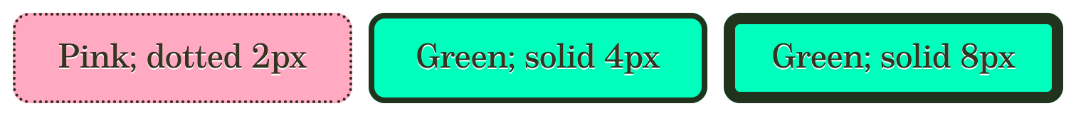
Here is the CSS and HTML for this exampleGo to a sidenote:
.minimal-practical {
  --input: var(--bg-value);

  background: var(--bg-value, var(--PINK));
  --bg-value: var(--GREEN) var(--WHEN, var(--input));

  border: var(--border-value, 2px dotted);
  --border-value: var(--input) solid;
}
<div class="minimal-practical">Pink; dotted 2px</div>
<div class="minimal-practical" style="--input: 4px">
  Green; solid 4px
</div>
<div class="minimal-practical" style="--input: 8px">
  Green; solid 8px
</div>
The only things we added compared to the previous example are --border-value and border properties. The --input is used directly for the border-width, and both the border-style and the background are assigned conditionally, based on the presence of --input.
What is Going On?anchor
There is a cyclic dependency! The same mechanism of custom properties that I used for my “Cyclic Dependency Space Toggles”, although relying on a slightly different aspect of it.
Let me quote the same specs as before, but now including a paragraph that I omitted the last time:
For each element, create a directed dependency graph, containing nodes for each custom property. If the value of a custom property
propcontains avar()function referring to the propertyvar(including in the fallback argument ofvar()), add an edge betweenpropand thevar.If there is a cycle in the dependency graph, all the custom properties in the cycle are invalid at computed-value time.
The most important part right now is the fallback part. Regardless if that fallback is applied, it is still used to determine if there is a cyclic dependency! This is what today’s technique relies on.
Let me show you the code for the original minimal example again:
/* A key static constant */
:root { --WHEN: }

.minimal {
  /* Our entry point, initialized with a cycle */
  --input: var(--bg-value);

  /* The property, with the “initial” value */
  background: var(--bg-value, var(--PINK));

  /* The conditional value, another part of a cycle */
  --bg-value: var(--GREEN) var(--WHEN, var(--input));
}
Here, our --input refers to the --bg-value, but the --bg-value refers back to the --input. Even though that reference is inside a fallback for a custom property --WHEN, that results in a cyclic dependency, and both --input and --bg-value become IACVT.
We can visualizeGo to a sidenote this as the following scheme:
This is where the --WHEN custom property comes into play: this custom property will be constant — we should never change it. Its value is the “empty” value, which is allowed in any other property. And that means that as this custom property is always set, it will always return that empty value, so at first glance you could think that var(--WHEN, var(--input)) won’t ever do anything.
But that mechanism of cyclic dependencies is the exception!
-
When our element keeps the default value for
--inputset to--bg-value, due to the later reference, this renders both variables IACVT. When thebackgroundproperty tries to read the--bg-value, it sees IACVT and uses the fallback — the element becomes pink. -
When we set the
--inputto some value — regardless of what exactly — by doing so, we break our cycle. It no longer references--bg-value, and thus the--bg-valuestops being IACVT. That value of--inputis wrapped with the--WHENcustom property, which, in this case, just outputs a valid empty value, not doing anything. And so thebackgroundproperty gets the value we defined alongside thatvar(--WHEN)— and becomes green.
For the second, example, when we add
--border-value: var(--input) solid;
border: var(--border-value, 2px dotted);
we don’t need to do anything extra because when the --input is a part of a cyclic dependency, it makes the whole --border-value have “guaranteed-invalid value”, so the border will use its fallback instead. Otherwise, if we pass some value, it will just use it.
That makes it pretty convenient for simple cases, and I still can’t get enough of how compact the code for this is in the end. Some of my initial attempts at this were much more verbose!
Adding Layersanchor
The above use case is already pretty powerful. It unlocks a minimal API on a component level, making it possible to provide a simple way to modify any parameters based on the presence of a single custom property. If anything, I can see this type of usage more production-ready than anything else I’ll be talking about.
However, I find it much more interesting to use this for prototyping native mixins. I already looked at how we can do them via custom cascade layers in my “Layered Toggles: Optional CSS Mixins” article. There, we had to use either cyclic or space toggles to “enable” some mixin. That meant that if we wanted to have some parametrized mixin, with that technique we had to toggle two custom properties: one that would enable the mixin and another that would set this parameter.
With indirect cyclic conditions, we can do both in one go! And it is so simple to do: wrap our core technique in @layer, and use revert-layer instead of the default “initial” value, applying the code on a * selectorGo to a sidenote:
@layer {
  * {
    --layered-input: var(--layered-bg-value);

    background: var(--layered-bg-value, revert-layer);
    --layered-bg-value:
      var(--GREEN)
      var(--WHEN, var(--layered-input));
  }
}
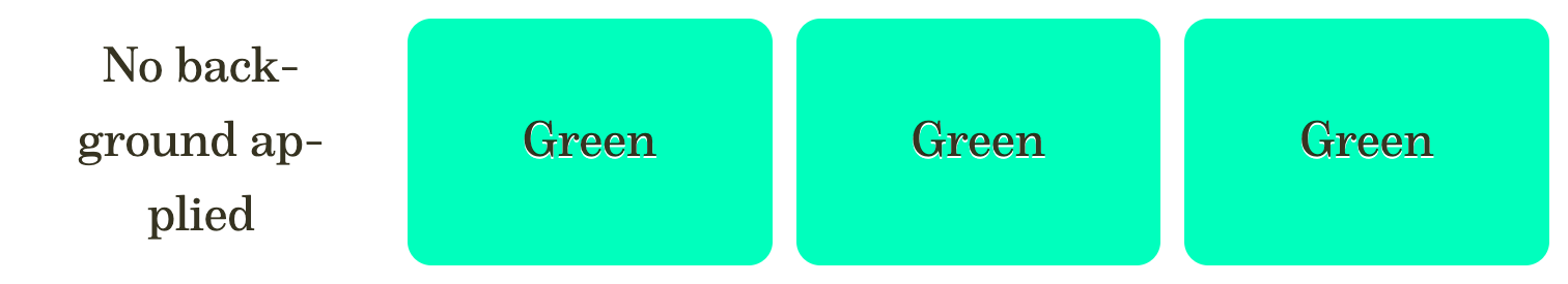
<div>No background applied</div>
<div style="--layered-input: foo">Green</div>
<div style="--layered-input: 8px">Green</div>
<div style="--layered-input: red">Green</div>
This works! Fun fact: in that example, there is a “No background applied” case. However, on this page, this mixin is applied as written — via * to all elements on the whole page! Everything else not being green is already a demonstration of how well this works.
One Input — Many Valuesanchor
In the examples above, we always had only one input custom property and applied it to a maximum of one indirect value. Obviously, we’d want to apply things to more than one custom property — otherwise, we could just use it directly.
A good example where this technique could be used in this way: small useful parametrized snippets, like Stephanie Eckles’ “Smol Responsive CSS Grid”. Here is its original code:
.smol-css-grid {
  --min: 15ch;
  --gap: 1rem;

  display: grid;
  grid-gap: var(--gap);
  grid-template-columns: repeat(
    auto-fit,
    minmax(min(100%, var(--min)), 1fr)
  );
}
This snippet uses 3 CSS properties. We can also see how its --min variable is the key one: without it, the snippet does not make much sense, and often it is something we’d want to adjust.
So, let’s convert this snippet into a global reusable mixin!
Use Case: Smol Gridanchor
So what ifGo to a sidenote we could just set a --smol-grid: 15ch on any element, and apply this smol grid mixin right there?
<div style="--smol-grid: 15ch">
  <div class="item">Item 1</div>
  <div class="item">Item 2</div>
  <div class="item">Item 3</div>
  <div class="item">Item 4</div>
  <div class="item">Item 5</div>
  <div class="item">Item 6</div>
</div>
@layer smol-grid {
  * {
    --smol-grid:
      var(--smol-grid-display)
      var(--smol-grid-gap);

    display: var(--smol-grid-display, revert-layer);
    --smol-grid-display:
      grid
      var(--WHEN, var(--smol-grid));

    gap: var(--smol-grid-gap, revert-layer);
    --smol-grid-gap:
      var(--gap, var(--rem))
      var(--WHEN, var(--smol-grid));

    grid-template-columns:
      var(--smol-grid-columns, revert-layer);
    --smol-grid-columns: repeat(
      auto-fit,
      minmax(min(100%, var(--smol-grid)), 1fr)
    );
  }
}
Now, that --smol-grid became a truly custom property: justGo to a sidenote applying it switches several things and applies a whole new layout on an element, parametrized by the value you pass to it. Imagine a whole CSS library full of mixins like that.
But let’s look at the code, and its critical point: how we need to list all the “dependencies” as our --smol-grid custom property’s initial value:
The rule is: whenever we’re deriving a state of some custom property with --WHEN, we need to short-circuit it back. Again, this is not necessary for --smol-grid-columns as the whole value will become not acceptable for grid-template-columns, but we need to create this feedback loop for the rest with --WHEN which is always valid otherwise.
Now, defining the --smol-grid breaks the cycle for the first two properties, and gets delivered to the third — and the mixin kicks in.
Use Case: Text-Overflowanchor
This example with a complex snippet is the best use case for custom mixins in CSS. But there are more common and simple cases. For example, sometimes, we have some property that requires multiple others to work, like text-overflow. Each time we wantGo to a sidenote to add it, we need not forget overflow: hidden and white-space: nowrap, which can make using it cumbersome.
What if we could do --ellipsis: yes, please and get everything applied?
Pretty simple (but yes, with more properties it gets verbose):
@layer ellipsis {
  * {
    --ellipsis:
      var(--ellipsis-text-overflow)
      var(--ellipsis-overflow)
      var(--ellipsis-white-space);

    text-overflow:
      var(--ellipsis-text-overflow, revert-layer);
    --ellipsis-text-overflow:
      ellipsis var(--WHEN, var(--ellipsis));

    overflow:
      var(--ellipsis-overflow, revert-layer);
    --ellipsis-overflow:
      hidden var(--WHEN, var(--ellipsis));

    white-space:
      var(--ellipsis-white-space, revert-layer);
    --ellipsis-white-space:
      nowrap var(--WHEN, var(--ellipsis));
  }
}
Here we make our --ellipsis the toggle, which initially creates three cycles:
Redefining it removes it from all three custom properties, passing their values to the corresponding properties.
Use Case: Resizableanchor
Sneakily, I already presented two demos of this use case in the earlier examples. Here is the first example of it again:
It is the ability to resize the container by dragging its bottom-right corner.
I really like the resize property, and how it allows us to test the responsiveness of something quicklyGo to a sidenote.
While this property is very straightforward, it requires us to have not just itself, but also actual overflow on the element. And, as I use this property quite often in my testing, it sometimes gets a bit tiresome. What if we could apply both properties in one go, via just a single custom property?
@layer resize {
  * {
    --resize: var(--resize-value) var(--resize-overflow);

    resize: var(--resize-value, revert-layer);
    --resize-value: horizontal var(--WHEN, var(--resize));

    overflow: var(--resize-overflow, revert-layer);
    --resize-overflow: hidden var(--WHEN, var(--resize));
  }
}
Setting --resize: yep on any element will add overflow: hidden to it as well as the resize itself, and the element will become resizeable!
Similar to the --ellipsis mixin, this creates two cycles based on the --resize variable:
Defaults and Mixed Valuesanchor
In that last example for the --resize, I’m not even using the actual value of --resize, treating just the presence of it as a signal that we want to enable it. When it is present, I apply the horizontal value, as I find it the best one in 99% of cases.
If we wanted to make it adjustable, we could do it similarly to the --smol-grid mixin: use the value directly. However, we will lose the nice side effect that we had, where we could pass any value, and get a very convenient behavior, where we could write just --resize: 1 instead of the full --resize: horizontal.
Another issue: we apply the overflow as hidden, but what if we want it to be auto instead?
There is one way we could improve our mixin with the help of registered custom properties that will simplify both use cases.
Here is the second version of our mixin. I am defining it as --resize2, if you remember, I am applying all the mixins in this article to everything on this page.
<div class="item" style="--resize2: both">
  You can resize me in both direction
</div>

<div class="item" style="--resize2: vertical">
  You can resize me only vertically
</div>

<div class="item" style="--resize2: auto; white-space: nowrap;">
  I am horizontally scrollable, that is: when overflown, I will have an actual scrollbar, wow, what an invention!
</div>
@property --resize2-value-typed {
  syntax: "horizontal | vertical | both";
  initial-value: horizontal;
  inherits: false;
}

@property --resize2-overflow-typed {
  syntax: "hidden | auto";
  initial-value: hidden;
  inherits: false;
}

@layer resize2 {
  * {
    --resize2: var(--resize2-value) var(--resize2-overflow);

    resize: var(--resize2-value, revert-layer);
    --resize2-value: var(--resize2-value-typed);
    --resize2-value-typed: var(--resize2);

    overflow: var(--resize2-overflow, revert-layer);
    --resize2-overflow: var(--resize2-overflow-typed);
    --resize2-overflow-typed: var(--resize2);
  }
}
Things become even more verbose!
We need to use an additional registered custom property for normalizing the value it receives from the --resize2. We need to have a separate custom property, as otherwise we couldn’t rely on the fallback to revert-layer: after all, a registered custom property will return its initial-value when IACVT. But what we can do is have this separate step that involves a non-registered custom property.
And, because we’re using our values directly, there is no need to add the --WHEN!
Sadly, we cannot define both values, like vertical and auto, as if we had a real CSS shorthand property.
What we could do is assign both --resize2: auto and --resize2-value: vertical, and it will work. But then, we will have a minor problem where, in this case, the --resize2-value by itself won’t work.
Many Inputs — One Valueanchor
In previous examples, we saw how we could define multiple custom properties from a single input. But what if we wanted to do the opposite: have multiple different inputs result in the whole mixin applying?
What if we took our --resize2, and wanted to call the mixin by setting just one of its variables: --resize2, --resize2-value, or --resize2-overflow?
This is possible, and here is a --resize3 that does just that, where we can set either it or --resize3-value and --resize3-overflow separately:
<div class="item" style="--resize3-value: both">
  You can resize me in both directions
</div>

<div class="item" style="--resize3-overflow: vertical">
  You can resize me only vertically
</div>

<div class="item" style="--resize3: auto; white-space: nowrap;">
  I am horizontally scrollable, that is: when overflown, I will have an actual scrollbar, wow, what an invention!
</div>
The issue: things become even more complicated, with the addition of two more custom properties.
@property --resize3-value-typed {
  syntax: "horizontal | vertical | both";
  initial-value: horizontal;
  inherits: false;
}

@property --resize3-overflow-typed {
  syntax: "hidden | auto";
  initial-value: hidden;
  inherits: false;
}

@layer resize3 {
  * {
    --resize3:
      var(--resize3-overflow)
      var(--WHEN, var(--resize3-overflow-final));
    --resize3-value: var(--resize3);
    --resize3-overflow:
      var(--resize3-value)
      var(--WHEN, var(--resize3-value-final));

    resize: var(--resize3-value-final, revert-layer);
    --resize3-value-final: var(--resize3-value-typed);
    --resize3-value-typed: var(--resize3-value);

    overflow: var(--resize3-overflow-final, revert-layer);
    --resize3-overflow-final:
      var(--resize3-overflow-typed);
    --resize3-overflow-typed: var(--resize3-overflow);
  }
}
It was rather difficult to come up with this specific setup of how all the properties should interact with each other. To do so, I had to first sketchGo to a sidenote a scheme of variables flow in --resize2 mixin:
Here we can see that we have two cycles: both starting from the --resize2, and each covers the corresponding property. The only way to “enable” this mixin is to set the --resize2, “severing” its connections, breaking the cycle, and making both properties work.
Redefining only --resize2-value or --resize2-overflow is not enough, as doing so keeps one other cyclic dependency intact.
The solution: to create a single continuous cycle, where severing one of the links leads to the removal of the cyclic dependency. There is also a complication where both custom properties that are going into overflow and resize properties must be a part of this loop, as our technique relies on making them IACVT through the cycle.
The way I solved it is by introducing two new variables that work as their inputs for each branch and then setting up the dependency graph in a particular way:
There are a few notable differences:
-
Previously, we had only one “entry point” — the
--resizevariable. To maintain how things flow, we need to make two other entry points in the same place: before the typed variables. -
Changing any of these should break the cycle, so we can just create a cycle out of them. This has one downside: the
--resize3value now goes into--resize3-overflowindirectly. Meaning: we can use--resize3: auto, and thisautowill be delivered to theoverflowproperty, but if we’d also set the--resize-value, then it will break. -
For things to work, we must include the
…-finalvariables in the cycle. And we need to do so in a very specific way, where removing any of our three entry points will not leave any cycles. To do so, we direct our graph from the final variables to the same variable where we already had a cycle: after doing--resize3-overflow→--resize, doing--resize3-overflow-final→--resizedoes not create any new cycles. Same for--resize3-value-final→--resize3-overflow.
This example is probably not very practical, but it shows that, with enough thought (and sketches), we can introduce several custom properties that enable the same mixin. We couldn’t always replicate the CSS “shorthands”, but it could cover most of the common use cases.
Inheritanceanchor
Switching the topic, let’s talk about inheritance. When playing with cyclic toggles and this technique as well, I found inheritance — or lack of it — to be both an upside and downside.
The cyclic dependency is not tracked across different elements: all custom properties involved in the cycle should be defined on the same element and not be inherited.
This can be pretty good for our mixins: when defining everything related to a mixin on the same * it essentially disabled any inheritance for all custom properties involved. After all, we don’t want to enable the mixin for every element of the subtree!
A Problemanchor
But what if we wanted to trigger some mixin from outside? We can do it with regular custom properties and techniques like space toggles. These custom properties (unless overridden on some element) will be inherited through the subtree and will get to the element that expects them.
Can we do something similar with our indirect cyclic conditions?
My first thought was to use another custom property that would be inherited, and then use it for our --input like
* {
  --input: var(--inherited-input, var(--bg-value));
  /*…*/
}
But that won’t work: remember how our fallback values participate in the cycles? Yeah. While the value of the --inherited-input could, technically, be substituted, it won’t break the cycle.
A Partial Solutionanchor
The key part of a solution is to split all our custom properties’ logic from their application — the property itself. Then, instead of applying the value to our property with a revert-layer fallback, we will use it to an inherited custom property as inherit.
What we do here is evaluate all our custom properties on every element, and then pass the result down the tree. That means whenever we apply our value, all the custom properties will be in the correct state:
<div class="block">
  The block itself, with default pink background
  <div class="element">The .element, with tiny border-radius</div>
</div>

<div class="block" style="--block-bg: var(--GREEN)">
  The block itself, with green background.
  Some nested div
  <div class="element">The .element, with pill-like border-radius</div>
</div>
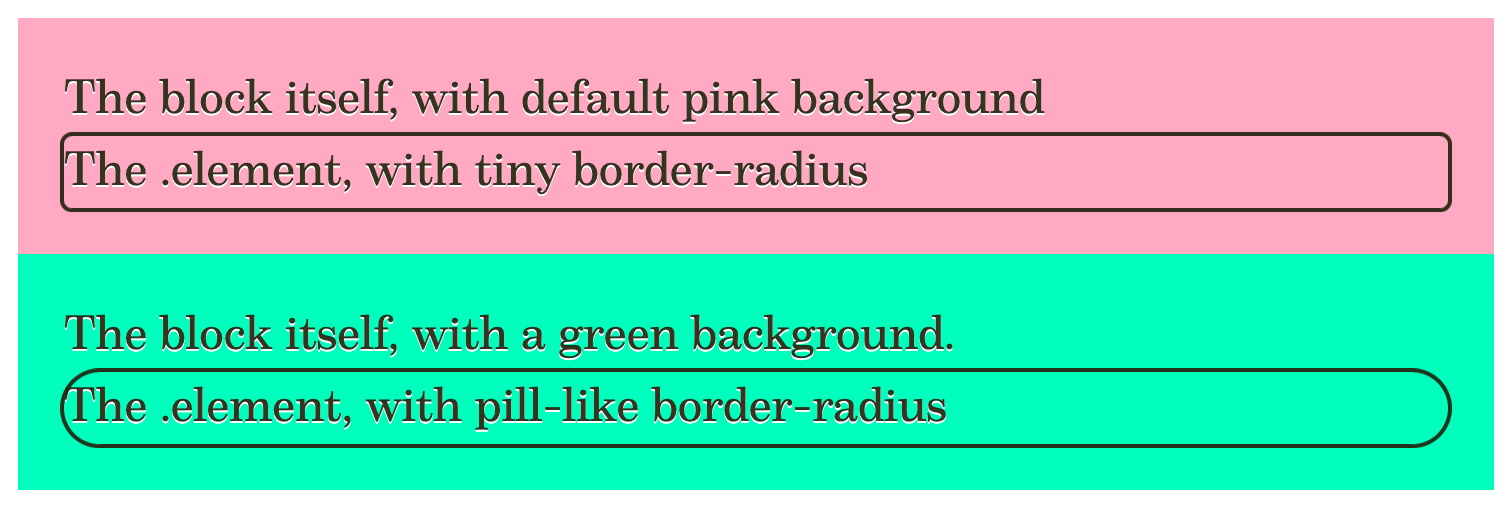
@layer {
  * {
    --block-bg: var(--border-radius-value);
    --border-radius-value:
      999px
      var(--WHEN, var(--block-bg));
    --element-border-radius:
      var(--border-radius-value, inherit)
  }
  .block {
    padding: 1em;
    background: var(--block-bg, var(--PINK));
  }

  .element {
    outline: 2px solid;
    border-radius:
      var(--element-border-radius, revert-layer);
  }
}
Why is this solution partial? If you look at it in Firefox or Chrome — it works. Not so much in Safari: due to a bug, which I reported back in June, and for which I added WPT tests.
Safari Workaroundanchor
We can fix the Safari issue via some style container queries:
@layer {
  .fixed * {
    @container style(--block-bg) {
      --border-radius-value: inherit;
    }
    @container not style(--block-bg) {
      --element-border-radius: var(--border-radius-value);
    }
  }
}
In the first container style query, we basically re-create the inheritance manually, but only for the elements inside a container that has --block-bg defined.
In the second container style query, we revert it for any elements that do not have a --block-bg defined on them.
It is not pretty, but it works.
A Nasty Firefox Buganchor
When doing my experiments, I encountered a very nasty Firefox bug related to cyclic dependencies.
The gist: do not use em or rem units for values depending on the cyclic dependencies! They can break any font-size that uses them through other custom properties.
A workaround is to define an --em captured custom property:
@property --em {
  syntax: "<length>";
  initial-value: 0px;
  inherits: false;
}
* { --em: 1em }
:root { --rem: var(--em) }
Here we register --em, assign it to 1em on every element, and then assign --rem to be one --em on the root.
This bug is one of the reasons why I won’t recommend using this technique in production: if there are weird bugs like this one, there is no telling which other situation could unexpectedly break. It might also be difficult to notice: because my mixins are applied to everything on the page, the “Smol Grid” mixin did actually break the font-size on this page, and I did not spot it for a few days while writing the article!
History & My Past Attemptsanchor
I am no stranger to tackling conditional CSS: from my “Conditions for CSS Variables” (October 2016), to “Layered Toggles: Optional CSS Mixins” (April 2024).
Curiously, that last article was written after Heydon Pickering’s question in Mastodon. My article did not answer it at the time, but it was a part of the solution, see the “Adding Layers” section above. And, actually, Heydon’s question was the exact problem I described at the beginning of this article:
CSS sense check: there’s no way to style an element, directly, based on the presence or absence of a custom property is there?
In one follow-up response, Heydon also clarifies:
I want to apply one style to all elements that have a certain custom property set. The custom property value and the list of elements are both indeterminate.
So, I guess, this article is now the answer.
Even before that question, I tried to solve this problem, and it sometimes felt that I came very close to a solution, but I never managed to get to it.
What led me to the final solution was another chain of events sparked by the discussion Lea Verou and I had about all the conditional CSS when she was working on her “Inline conditionals in CSS, now?” article.
She asked me:
Is there any way to transform a number or keyword into a space toggle btw? Cause then you could combine approaches
I showed her one of my experiments that was almost it, but she mentioned that it did not work in Firefox.
Two hours later, she showed me a workaround for this issue, which unlocked that method I was trying to achieve at the time — something I namedGo to a sidenote “Keyframed Toggles”.
Initially, I was hesitant to share it because of the method — animations. It just did not feel right to use them for logic, even though in practice it might have been all good.
With time, I continued thinking about this problem and finally decided to write about this technique. I started a draft and wrote around 1500 words there. But one evening, after finishing a large portion of that draft — specifically the part about how we can use them with cyclic toggles — I wondered if we could do something that would be pure — not using animations, for the same effect.
One note after another, a few random and not fruitful ideas later, I decided to go to bed. Only to find myself in my bedroom, grasping at yet another idea — one that made me go back to my setup and try it out. No, that was not the technique behind this article: it was another idea, very similar to “Indirect Cyclic Conditions”, but more verbose and flawed.
At the time, with all its issues, it seemed like a step up from the Keyframed Toggles: after all, it relied on the simple logic of registered custom properties, no animations in sight.
I put away my old draft and started a new one. Wrote another thousand words from scratch. And guess what!
The technique had some issues and limitations, and I was brainstorming to see if I could find a solution to at least some of them. One test after another, I stumbled upon a combination of things that did work: one that used the custom property’s fallback that is a part of a cycle.
It was then time to retire that draft as well and start working on this article. I was contemplating if I should omit writing about these past techniques, or separate them into another article. After many conflicting thoughts, I decided to do the latter. While I don’t have a guarantee that I will write about these past attempts in detail, I will likely cover them in my less polished blog eventually.
The Futureanchor
In the future, we will be able to achieve this with native conditions and native CSS mixins. But — it is still very far away. We have only the drafts for the functions and inline conditionals today, and mixins (explainer by Miriam Suzanne) are likely even further away.
That said, I believe that the technique I described in this article is enough for us to start prototyping various mixins we could have in the future. I might’ve chosen not the best examples to demonstrate the technique (aside from the brilliant “Smol Grid” by Stephanie), but that’s where I’d like to pass the baton to you.
Please do not apply this technique in production — instead, go play with it in CodePen or any other environment you’re comfortable experimenting in. Do you have some code you repeat over and over again? See if it is possible to abstract it via this technique.
I often see notions that CSS becomes too complicated. Yes, and I strongly consider custom native functions and mixins one way out of that complexity. They can be a solution allowing us to isolate complex parts into smaller abstracted reusable pieces of code.
Playing with the prototypes like in this article — and sharing them — could bring the mixins closer to reality. It will allow us to explore the potential use cases and will show browser vendors that this is something that the authors want.
Published on with tags: #CSS Variables #CSS Logic #CSS Layers #Experiment #Practical #CSS