Position-Driven Styles
After solving the fit-to-width text, stuck state for sticky elements, and scroll shadows, I wondered: how many other items from various CSS wishlists could I solve with scroll-driven animations? A lot. Styling flex and grid rows and columns, staggered animations, wrap detection, and more — all in my new article.
Disclaimeranchor
Like the ones before it, this article uses experimental web platform features. At the moment of writing, examples work only in Chrome CanaryGo to a sidenote, but I am providing videos for all of them, allowing you to see how they work. However, for the best experience, try opening the article in Chrome Canary: it can be fun to play with the examples there!
The Key: overflow: hiddenanchor
If you did read my previous article, you could see that we did use the “scroll-driven animations” to achieve the “fit to width” effect for the text. However, you could’ve noticed that we did not have anything scrollable in the examples.
That is the whole idea: to use the scroll-driven animations, we don’t needGo to a sidenote to scroll something. The only thing we need — is for the container to be a “scroll container”, which we can achieve with overflow: hidden. To quote the specs:
- hidden
[…]. However, the content must still be scrollable programmatically, for example using the mechanisms defined in [CSSOM-VIEW], and the box is therefore still a scroll container.
Value Distributionanchor
An easy way to demonstrate how an item can get affected by its position in a scroll container is to have multiple items there. That would allow us to apply the same “animation” to each of them and see what happens. That’s what I would be doing for most of the examples.
Linear Gradientanchor
Let’s say we want to give list items a value based on their vertical position inside their container in a linear fashion, choosing a solid background from a gradient.
Here is the CSS responsibleGo to a sidenote for the backgrounds and colors of these items:
.example-gradient {
  --gradient-direction: block;
  --gradient-range: var(--range);

  & .item {
    animation: gradient linear reverse both;
    animation-timeline: view(var(--gradient-direction));
    animation-range: var(--gradient-range);
  }
}

@keyframes gradient {
  from {
    background: var(--pink);
    color: #FFF;
  }
  60% {
    color: #FFF;
  }
  60.01% {
    color: #000;
  }
  to {
    background: var(--yellow);
    color: #000;
  }
}
Here we apply a scroll-driven animation, using both the from and to keyframes to set the background and foreground colors through a linear interpolation based on each item’s position inside their container.
A few things to note:
-
The
--rangein question is the following for the vertical direction:--range: cover var(--min-height) cover calc(100% - var(--min-height));We could’ve used a simple
cover, but if we want to use the exact colors from the keyframes for the top and bottom items, we need to adjust therange. You can toggle the “Use default range” to see the difference. -
For the
animation: gradient linear reverse both:linearis a good default, but it is possible to play with other easing methods if we’d want to achieve a different result.- I find it helpful to have
reversefor the animation to make the code more readable: we want the top items to have thefromkeyframe — and the bottom items to have thetoone. Withoutreverse, things would be flipped (as the default scroll direction would go the other way). bothis the value for theanimation-fill-mode. Without it, when the element would go out of the defined range bounds, it would not get the closest keyframe applied to it. We will want to use it almost every time, though there could be rare exceptions.
-
In the
gradientkeyframes, we provide thecolor. That allows us to connect the backgrounds with the contrasting versions of the text color for better contrast. I did choose the point that felt good enough, but it could be potentially tweaked (and depends on the exact colors we will be using).
Diagonal Gradientanchor
In the above example, we could easily switch between the vertical and horizontal gradient: by changing the view(block) to view(inline). But what if we’d want the gradient to go diagonally?
There could be multiple approaches to this; the one method I liked the most was to overlay the same gradient via mix-blend-mode, applying animations on two elements and mixing their backgrounds.
We did reuse the same keyframes on a pseudo-element inside, and if we wanted to stop at adjusting the backgrounds, we could end it there. But what about the text color? We cannot achieve the same effect for it with mix-blend-mode, and the keyframes for one of the axis would override the color from the other.
We ended up with a more complex solution: instead of using the color in the keyframes, I used two sets of keyframes for two dimensions with the space togglesGo to a sidenote inside!
Here is the CSS used for the color:
--is-light--y: initial;
--is-dark--y: ;
--is-light--x: initial;
--is-dark--x: ;
--is-dark: var(--is-light--x, var(--is-light--y)) #000;
color:
  var(--is-light--x, var(--is-light--y, #FFF))
  var(--is-dark,);
And then the following keyframes (and a copy for the other direction):
@keyframes gradient-x {
  from {
    --is-light--x: initial;
    --is-dark--x: ;
    }
  50% {
    --is-light--x: initial;
    --is-dark--x: ;
  }
  50.01% {
    --is-light--x: ;
    --is-dark--x: initial;
    }
  to {
    --is-light--x: ;
    --is-dark--x: initial;
  }
}
That allowed us to choose the color based on two coordinates! But does this method scale? What if we would want to apply it to more properties and in a more precise manner? Would we need to rely on hacks like this?
Distributing Anything: @propertyanchor
Whenever we experiment with a new technology in a browser, we must consider all the features that are present alongside it. We’re dealing only with Chrome Canary — is there something available to us that can be helpful when dealing with the keyframes?
Well, I did mention it in this section’s header — we have the @property which allows us to register a custom property with a specific narrowed-down syntax.
How would this be of help to us? We cannot interpolate unregistered custom properties with the animation keyframes. But we can do this with the registered ones!
And if we can distribute two properties over both axes from 0 to 1, we unlock many things. I’m not good at math and these kinds of experimentsGo to a sidenote, but as a quick demo of what is possible, here I’m using these two distributed values for adjusting the background, color and transform:
The core of this is our registered custom properties and the keyframes that interpolate them across both axes:
@property --x {
  syntax: "<number>";
  inherits: true;
  initial-value: 0;
}

@property --y {
  syntax: "<number>";
  inherits: true;
  initial-value: 0;
}

@keyframes x-distribution {
  from { --x: 0 }
  to   { --x: 1 }
}

@keyframes y-distribution {
  from { --y: 0 }
  to   { --y: 1 }
}
The best part: we have to define one set of keyframes per axis here and register two custom properties, even though we would want to use different ways to distribute them across different properties! Here is the animation definitionGo to a sidenote for our elements:
animation:
  y-distribution ease-in-out reverse both,
  x-distribution ease-in-out reverse both;
animation-timeline: view(),       view(inline);
animation-range:    var(--range), var(--range-x);
With this, each element gets an --x or --y property starting from 0 and ending in 1 based on its position in the container. And we can use math to change this distribution in various ways!
Here is how I’m setting the background:
--center: calc(
  0.5 * (
    sin(var(--x) * pi) +
    sin(var(--y) * pi)
  )
);
background: color-mix(
  in oklch,
  var(--pink) calc(100% * var(--center)),
  var(--yellow)
);
With the help from the sin() and pi, the --center variable ends up going from 0 to 1 and then back to 0 allowing us to distribute the color radially. I will reuse the --center for the transform, but also the color:
color:
  hsl(0, 0%, round(var(--center) * 100% * 1.75, 100%));
Because we want to connect the backgrounds to the colors, we can use the round() to make the color black or white to be contrasting. Again, I did use the 1.75 to adjust the point at which the value would flip — we should choose it based on the exact colors we would be using.
For the rotate and translate parts of the transform, I use a different distribution, again based on our original --x and --y properties:
--x2: (var(--x) - 0.5)*2;
--y2: (var(--y) - 0.5)*2;
--rotation: calc(var(--x2) * var(--y2) * -22.5deg);
--translate:
  calc(var(--x2) * var(--x2) * var(--x2) * -25%),
  calc(var(--y2) * var(--y2) * var(--y2) * -35%);
It is simple: we subtract 0.5, and then multiply the result by 2, transforming the 0 → 1 to -1 → 0 → 1. Then I’m using some very arbitrary values for the rotation and translation that did look good enough.
Other Use Casesanchor
This method — using two interpolated variables per axis — covers many use cases that are commonly requested.
However, some things are impossibleGo to a sidenote, like getting the length of our list or getting the precise index for each item. However, as we saw above, what we have is enough for many things. After all, the need for the exact count and index is often used for distributing elements along the whole range — and with the scroll-driven animations, we can do that, as I did show in the examples.
There is another use case that our examples did not yet cover.
Staggered Animationsanchor
If we can assign variables per element, could we use them for “staggered” animations, modifying their delays or durations based on them?
In some cases, we can! Not in a straightforward way, but it is possible.
There were two things I had to do to make this work:
- “Cleanse” the “animation-tainted” custom properties.
- Apply the animation on a nested element instead of alongside the scroll-driven animations.
Without these, we cannot base our animations on our --x and --y variables. What are “animation-tainted” custom properties? Let me quote the specs:
[…] any custom property used in a
@keyframesrule becomes animation-tainted, which affects how it is treated when referred to via thevar()function in an animation property.Animation-tainted is “infectious”: custom properties which reference animation-tainted properties also become animation-tainted.
And from the var() specs:
If the custom property named by the first argument to the
var()function is animation-tainted, and thevar()function is being used in a property that is not animatable, treat the custom property as having its initial value for the rest of this algorithm.
To stagger our animations, we have to apply the variable to the animation-delay, which is not animatable.
But we can work around this by “cleansing” the variable. To do so, we need to register two new custom properties:
@property --x-animatable {
  syntax: "<number>";
  inherits: true;
  initial-value: 0;
}

@property --y-animatable {
  syntax: "<number>";
  inherits: true;
  initial-value: 0;
}
And then, when we want to use --x and --y cleansed, we assign them to these new properties.
--x-animatable: var(--x);
--y-animatable: var(--y);
--sum-animatable: calc(
  (var(--x-animatable) + var(--y-animatable)) / 2
);
Now, we’re free to use the --sum-animatable for staggering the animation-duration!
This is due to the way the registered custom properties behave when substituted via var():
Any
var()function that references a registered custom property must be replaced with an equivalent token sequence, which is equal to the token sequence that would have been produced by serializing the computed value, and tokenizing the resulting string.
Due to this, if I understand everything correctly, the custom property loses the “tainted” status.
However, we cannot apply this directly on the element alongside the scroll-driven animations that set the --x and --y. I could not find the exact place that talks about this, but this sounds logical, as otherwise, we could create an infinite loop.
And by moving our styles to the inner element, we can create a staggered animation, all without hardcoding any indexes, rows, or columns.
The main limitation of this method is that the elements should be positioned in a certain way inside their container to get the value distributed among them properly. However, we could want them to be in a different arrangement for the animations to make sense. We could try working around this by first outputting the elements in a list using the natural flow, but then tearing their children from it by absolute positioning, allowing us to position elements first and then apply the animations in any way we want.
Controlling the Stackinganchor
There are many other use cases for this way of distributing things, but one other thing I remember seeing people request — the ability to change the way elements are stacked via z-index.
By default, elements that go later in the DOM would be shown on top of items before them unless we will override the z-index. But because we can distribute any values, we can adjust this aspect without manually assigning a value for every element!
In the below example, the first stack is in the regular order, which we change to reverse for the second stack, and then make it stack from the center for the third one.
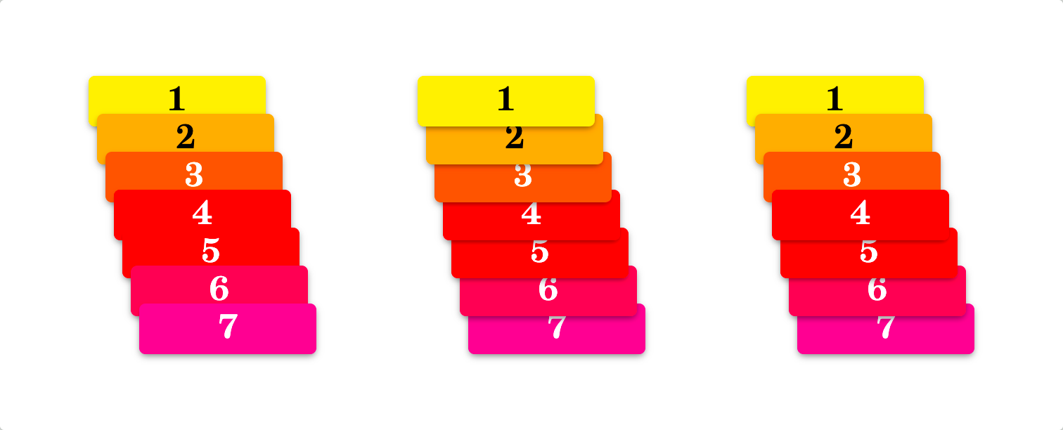
In this example, for the reverse and the centered stacks, I’m doing the following:
.example-layers--reverse .item {
  z-index: calc(100000 * (1 - var(--y)));
}

.example-layers--middle .item {
  z-index: calc(100000 * sin(var(--y) * pi));
}
As we can see, we can use a “big enough” value and then spread it across our elements, using the same distributed --y value. And we must not forget to establish the stacking context on the container around our items, not allowing their large values of z-index to escape their context.
Edge Detectionanchor
One limitation I would name for the above value distribution method is that it is not super reliable when we need to get specific information about the position of our elements. Because all the values are distributed automatically across the whole range, it is hard to tell when looking at a particular item where exactly it is located in its container.
However, there are four simple exceptions: the edges.
We could define our animations in a way where we could independently retrieve the information about our element’s location: is it located at a certain edge — the start or end of an inline or block direction?
In the example above, we add text to the ::after pseudo-elements based on their parents' locations. We can see the real-time updates of the pseudo-elements by resizing the example.
Here is the CSS responsible for the pseudo-elements:
&::after {
  content:
    ' '
    var(--is-inline-start, '←')
    var(--is-block-start, '↑')
    var(--is-block-end, '↓')
    var(--is-inline-end, '→');
}
How did we achieve this? By applying four animations — each toggling its space toggle variables and allowing us to use any logic based on their values.
@keyframes block-detection {
  from {
    --is-block-start: initial;
    --no-block-start: ;
  }
  to {
    --is-block-end: initial;
    --no-block-end: ;
  }
}

@keyframes inline-detection {
  from {
    --is-inline-start: initial;
    --no-inline-start: ;
  }
  to {
    --is-inline-end: initial;
    --no-inline-end: ;
  }
}
We can see that we can have two sets of keyframes, each responsible for its axis. Then, we need to set up four animationsGo to a sidenote using these keyframes:
animation:
  block-detection  linear forwards,
  block-detection  linear reverse backwards,
  inline-detection linear forwards,
  inline-detection linear reverse backwards;

animation-timeline:
  view(),
  view(),
  view(inline),
  view(inline);

animation-range:
  exit    0 exit    1px,
  contain 0 contain 1px,
  exit    0 exit    1px,
  contain 0 contain 1px;

--is-block-start: ;
--no-block-start: initial;
--is-block-end: ;
--no-block-end: initial;
--is-inline-start: ;
--no-inline-start: initial;
--is-inline-end: ;
--no-inline-end: initial;
Three things to note:
- We need to apply
forwardsandbackwardsto thestartandendanimations, reducing the possibility of subpixel and rounding errors. - For the
animation-range, we target the first pixel on each side. We could modify its value if we have any paddings or bump it up if we’re sure our element would be larger than that value. That is likely the most fragile part of this technique: we must ensure the ranges apply and do not overlap. - We are using two space toggles for each side, as this simplifies the common negation use cases.
And that’s it! Now we can use our space toggles, alongside any boolean logic for them, achieving many different effects based on the element’s position.
Adjusting Cornersanchor
A simple use case for this method could be applying the consistent border-radius for the elements at the corners of a list.
Thanks to the dashed border, we can see how the corners are “proper” and apply to the elements themselves, and not faked by having a bigger border-radius with overflow: hidden on the parent.
The code is not super clean — due to the necessity to use boolean logic, but still readableGo to a sidenote enough:
--not-start-start:
  var(--is-block-start, var(--is-inline-start)) 0.5rem;
--not-start-end:
  var(--is-block-start, var(--is-inline-end))   0.5rem;
--not-end-start:
  var(--is-block-end,   var(--is-inline-start)) 0.5rem;
--not-end-end:
  var(--is-block-end,   var(--is-inline-end))   0.5rem;

border-start-start-radius:
  var(--is-block-start, var(--is-inline-start,  1.5rem))
  var(--not-start-start,);
border-end-start-radius:
  var(--is-block-end,   var(--is-inline-start,  1.5rem))
  var(--not-end-start,);
border-start-end-radius:
  var(--is-block-start, var(--is-inline-end,    1.5rem))
  var(--not-start-end,);
border-end-end-radius:
  var(--is-block-end,   var(--is-inline-end,    1.5rem))
  var(--not-end-end,);
Styling the First Lineanchor
Another case I saw requested — styling the items on the first line differently from the rest. With edge detection, we can do this!
Because we have both the “on” and “off” versions of the space toggles, the code is straightforward.
background:
  var(--is-block-start, hotpink)
  var(--no-block-start, pink);

color:
  var(--is-block-start, #FFF)
  var(--no-block-start, #000);

--min-height:
  var(--is-block-start, 4rem)
  var(--no-block-start, 2rem);
We could do the same if we want different styles for the last row or the first or last columns.
Flex-Wrap Detectionanchor
This February Ahmad Shadeed wrote an article “Do we need CSS flex-wrap detection?” where he proposed a few use cases for detecting when the elements wrap.
Guess what — edge detection can solve all these use cases!
Site Headeranchor
In this exampleGo to a sidenote, we want to detect when our menu does not entirely fit into the available space to the right of the logo, and if it doesn’t, then we want to replace it with a button.
For this example, we want to prepare HTML in a way we could place our menu button between the logo and the following list:
<div class="example-edges example-flex-wrap-1">
  <div class="item">Logo</div>
  <div class="item pancakes"><button type="button">Menu</button></div>
  <ul class="item">
    <li><a href="#Home">Home</a></li>
    <li><a href="#About">About</a></li>
    <li><a href="#Services">Services</a></li>
    <li><a href="#Hire_us">Hire us</a></li>
    <li><a href="#Contact">Contact</a></li>
  </ul>
</div>
Then, we can adjust this button’s CSS to hide it until necessary. Here is most of it:
& .pancakes {
  display: flex;
  flex-basis: 0;
  min-width: 1px;
  margin-inline-start: auto;
  justify-content: end;
  visibility: var(--no-inline-end, hidden);
}

& ul.item {
  visibility: var(--no-block-start, hidden);
}
The crucial part is toggling the visibility of both the button and the menu. By doing it, we guarantee that only one or another is visible and accessible at any time.
Tabsanchor
In this example, we want to expand all items when they do not fit.
One thing we have to prepare in HTML is to wrap all the items except for the first in an element, allowing them to wrap as a whole (and be tracked by the edge detection):
<p class="example-edges example-tabs">
  <a class="item" href="#Home">Home</a>
  <span class="wrapping item">
    <a href="#About">About</a>
    <a href="#Services">Services</a>
    <a href="#Hire_us">Hire us</a>
    <a href="#Contact">Contact</a>
  </span>
</p>
The whole CSS is more convoluted due to the way we want to style the example: we’re using a pseudo-element for the hover area of our wrapped elements, which we hide via
visibility: var(--is-block-end, hidden);
for the first element, and
visibility: var(--no-inline-start, hidden);
for the wrapped ones.
Then, we set the conditional width on all the links inside our wrapped container:
width: var(--is-inline-start, 100%);
And that’s it!
Auto Margin And Flex Wrappinganchor
In this example, we want to remove the auto-margin when the right part wraps.
That was the simplest case. With this HTML:
<p class="example-edges example-auto-margin">
  <a class="item" href="#Home">Ahmad Shadeed</a>
  <span class="wrapping item">
    <button type="button">Edit</button>
    <button type="button">Bookmark</button>
  </span>
</p>
And the edge-detection on the .items, the only thing we need to do is to adjust the margin on the .wrapping:
margin-inline-start:
  var(--is-block-start, auto)
  var(--no-block-start, 0.5rem);
What Did We Learnanchor
To sum up everything from this article:
- We can use scroll-driven animations for elements inside the containers that have
overflow: hidden, making it possible to style things based on their positions. - We can distribute values across both axes either by regular keyframes that interpolate a property like
background, or by interpolating a registered custom property via@property, making it possible to use an element’s position more flexibly. - By adding another registered custom property, we can even achieve staggered animations!
- We can detect if an element is placed right at the edge of its container, allowing us to style the corresponding rows and columns or the items in the corners.
- We can use this edge detection to adjust styles of elements that wrap.
I was surprised by how many use cases I saw in various CSSWG issues I could solve with this “position-driven styles” technique!
Not all the solutions are clean, and many are fragile. I would be happy to see all the native features for these, but in the meantime, we can experiment with what we have and explore how things could look and feel beforehand.
Stay Tunedanchor
Surprise! While working on this article, I had to stop myself from adding even more techniques and examples. There are a few wild experiments that I’m working on that I want to finish: expect at least one more article about scroll-driven animations combined with other recent CSS features in the future!
Published on with tags: #Scroll Driven Animations #Future CSS #CSS Variables #Experiment #Practical #CSS